Tidal Mobile Redesign
UX Research, Writing, and Design
Introduction
I am a music enthusiast who decided to switch music streaming services from Spotify to Tidal because of their higher payout rates to artists.
When I made the switch, I immediately noticed that the user experience in the Tidal app wasn't on the same level as Spotify, which could hinder its goal of becoming the top streaming service.
This made for a perfect practice UX job, and I wanted to see how I could improve the design in an innovative and intuitive way.
Solutions
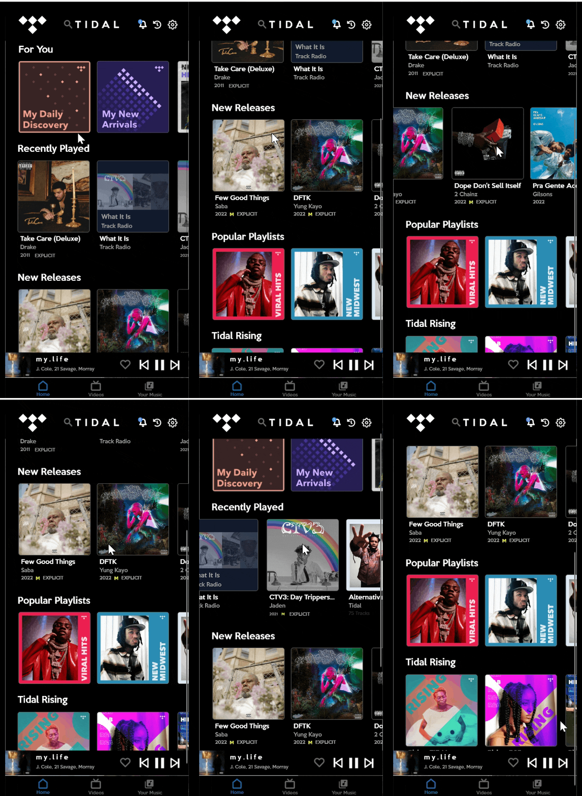
✅ Reduced the amount of negative space between columns.
✅ Added a like option to the song that is playing on the home screen.
✅ Added a settings button to the homepage.
✅ Added a history button to the homepage.
✅ Added words underneath the icons in the navigation.
✅ Reduced the icons in the navigation from five to three.
❌ Users found the spacing on the Tidal app awkward to use.
❌ Users wanted a more accessible like button.
❌ Users wanted an easier way to get to the settings menu.
❌ Users wanted a history option.
❌ Users struggled to understand what the navigation icons were.
❌ Users said there are too many icons in the navigation.
User Pain Points
Existing Tidal Mobile App Design
Home Page


"My Activity" Page


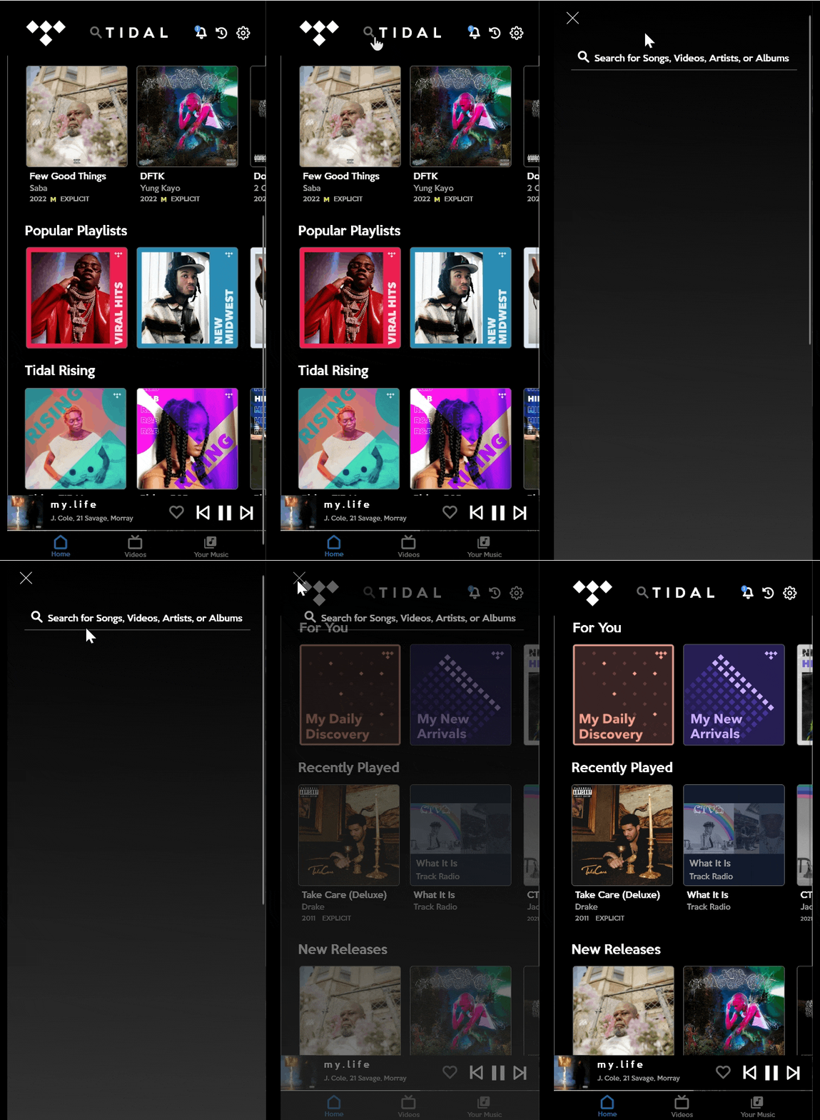
Search Page


A Closer Look
Navigation Problems
-
Navigation without words leaves the user guessing what each symbol means.
-
Five icons make it easy to accidentally tap the neighbors of a target icon.

No Like Option
-
If a song comes on and the user likes it, they have to stop what they are doing to go to the song and favorite. Adding this option will save them time and frustration.
Awkward Spacing
-
Nobody likes unnecessary scrolling. White space is great if used effectively, but in this case it feels awkward.


User Research
I gathered seven friends, both men and women between the ages of 17-30. Four listened to music for more than four hours a day on streaming services. The other three listened for less than four hours a day. They took a short survey before the test.
Significant Results
-
All of them currently pay for music streaming services.
-
Four Spotify Users
-
Two Apple Music Users
-
One Amazon Music User
-
None of the users had used Tidal before.
-
All of the users stated they were happy with their streaming service.

User Testing
Each user downloaded the Tidal app on their phone and signed up for the free version. I continued my research by asking them three questions pertaining to their impressions and understanding of the Tidal app.
Pre-Trial Questions
-
Have you heard of Tidal before?
-
Where do you think the navigation buttons will lead you to?
-
What are your immediate first impressions when opening the app for the first time?
Results
-
Four of Seven users had heard of Tidal, but were not familiar with it.
-
Users were only able to Identify the "Home" button and "Search" button correctly.
-
Comments included: "It looks like a lesser Spotify" and "The spacing between things feels off".
Icons for reference

_edited.png)
_edited.png)
Trial and Results
Afterwards, I asked participants to use the app for a day and write down their opinions, both good and bad. After 24 hours, the users sent me all of the thoughts they wrote down during their trial. The goal of this trial was to confirm that the problems I identified were also problems others experienced. The pre-trial questions confirmed my thoughts on the awkward spacing and navigation issues (no text, odd icons); the results below focus on other aspects of the app.
Confirmed Usability Issues
-
Five of seven users stated they wish a favorite button was more easily accessible.
-
Four of seven users said they liked the My Activity page, but didn't think it needed its own navigation button.
-
Four of seven users said they wish the settings panel was included on the home page.
New Usability Issues
-
Three of Seven users did not like the play icon covering images.
-
Spotify users mentioned that they miss the history button.

Tidal Mock-Up
1. Negative space reduced.


2. Search button on home page for one click searching instead of two.


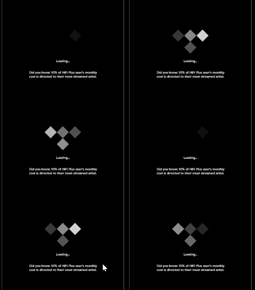
3. Loading screen with an example of UX writing.

4. New simple navigation

5. Like button added by song
